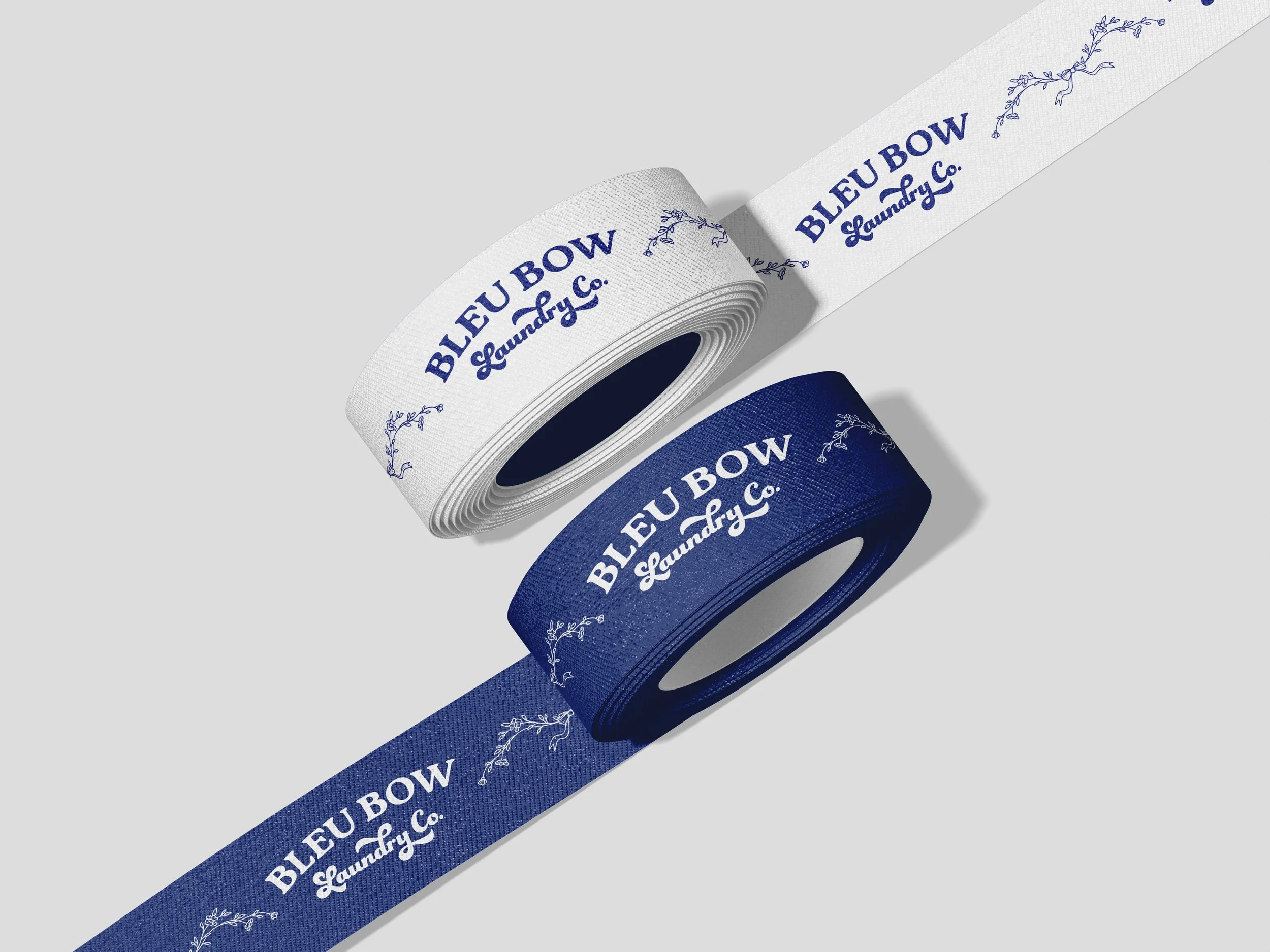
Bleu Bow Laundry Co Branded Ribbon
Laundry Pick-up and Delivery with “Bleu Bow” Service
Emily Martinez picks up laundry from households in Verrado, Arizona, and the nearby West Valley. She washes, then dries, folds, or hangs it, then brings it back within 48 hours, tied in a blue bow. Her service caters to busy professionals who need help around the house but also want to know their clothing is cared for as they would.
Emily came to us with a solid business plan and a great name: Bleu Bow Laundry Co., named after her dog, Kenzie Bleu. She needed the brand itself: a logo, business cards, and a marketing strategy.
Sorting the Brand
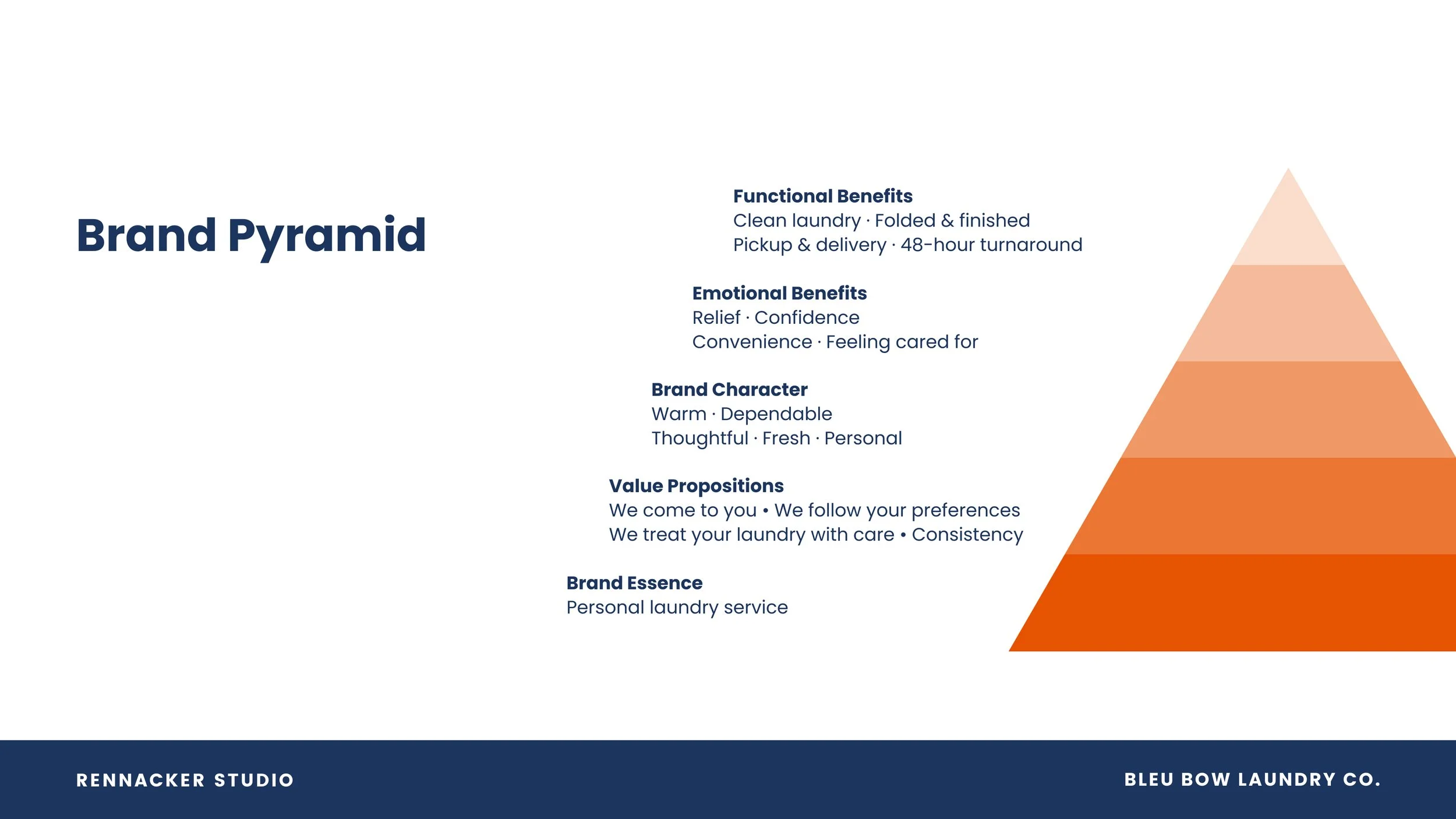
Bleu Bow is a personal laundry care service, delivered with convenience and dependability.
What sets Emily apart is that every order can be personalized. The client can choose their folding style, detergent, scent, and hanging. So we wanted to create a brand that felt fresh, premium, and customizable.
Mission: make laundry easier through dependable pickup, thoughtful care, and a personal touch.
Vision: make professional laundry care feel personal, familiar, and effortless.
Brand Values:
Care: consistent handling, folding, finishing, and packaging
Consistency: customers always know what to expect and when
Personal: listening to individual preferences and honoring special requests
Pre-treating the pain points
Before we began concepting, we decided what to design and why. Each deliverable has a specific job:
Business cards are an obvious networking tool.
The blue ribbon is a creative play on the brand name and a personalized touch for returning a customer's fresh, folded laundry.
Thank-you cards are punched so the ribbon feeds through them. They thank the customer for their patronage and build brand loyalty.
Door hangers are a passive, low-cost advertising mechanism.
The service intake form is an interim solution until a website with digital intake forms is built. It gives clients a systematic way to specify their care instructions to Emily.
Laundry bags are promotional items for clients who set up a monthly retainer. Customers can use the branded canvas bags in place of 13-gallon trash bags, adding a more premium touchpoint for repeat customers.
Scrubs are a uniform that reinforces the brand during pick-up, drop-off, and consultations.
The email signature covers the times Emily communicates by email.
We designed two creative concepts and applied them across the suite of deliverables, allowing Emily to compare concepts side by side.

Concept 1: Mid-Century Laundromat

Concept 2: French Laundry
Concept 1: Mid-Century Laundromat
Our first concept approached the brand with a nostalgic, warm, retro look and feel. We designed a color palette from pink, green, and saffron yellow, the soft, sunny colors of mid-century kitchens and appliances, so the brand feels vintage at first glance.
For typography, we chose three typefaces: Rhythm One is a funky, retro display typeface that gives the name its personality. Smoothie Script is a flowing script typeface with handwritten-style letters, which adds a personal touch. DIN is a clean, utilitarian sans serif typeface that keeps the pricing and important details easy to read. We paired them with a heart-and-bow logo mark, as a subtle nod to the bow in the name and the care behind the service.
Emily loved the logo, the typefaces, and the colors, but she was not as fond of the pattern. It felt too nostalgic to her, and a little "old.” Great feedback!
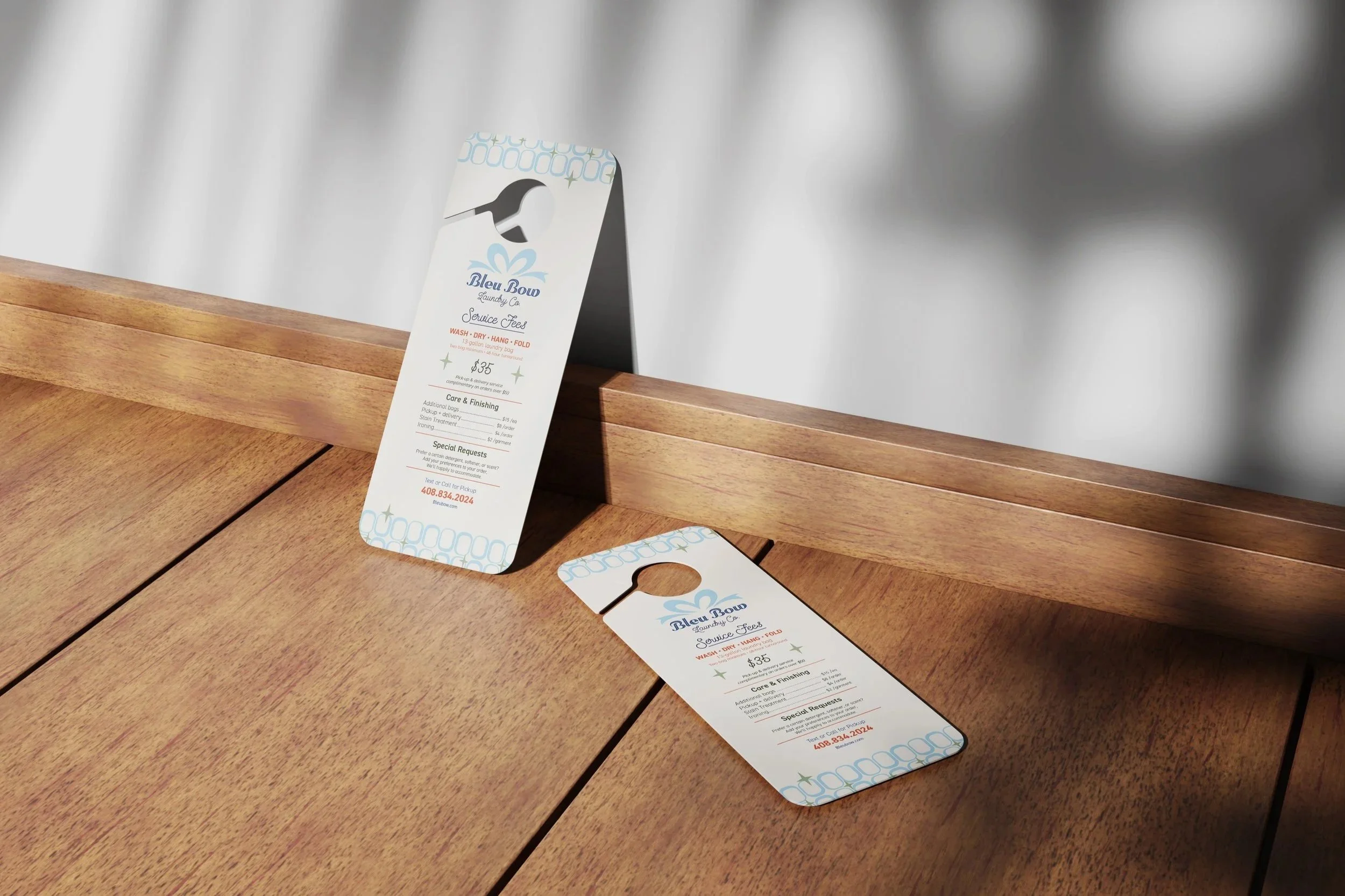
Concept 1 Door hangers
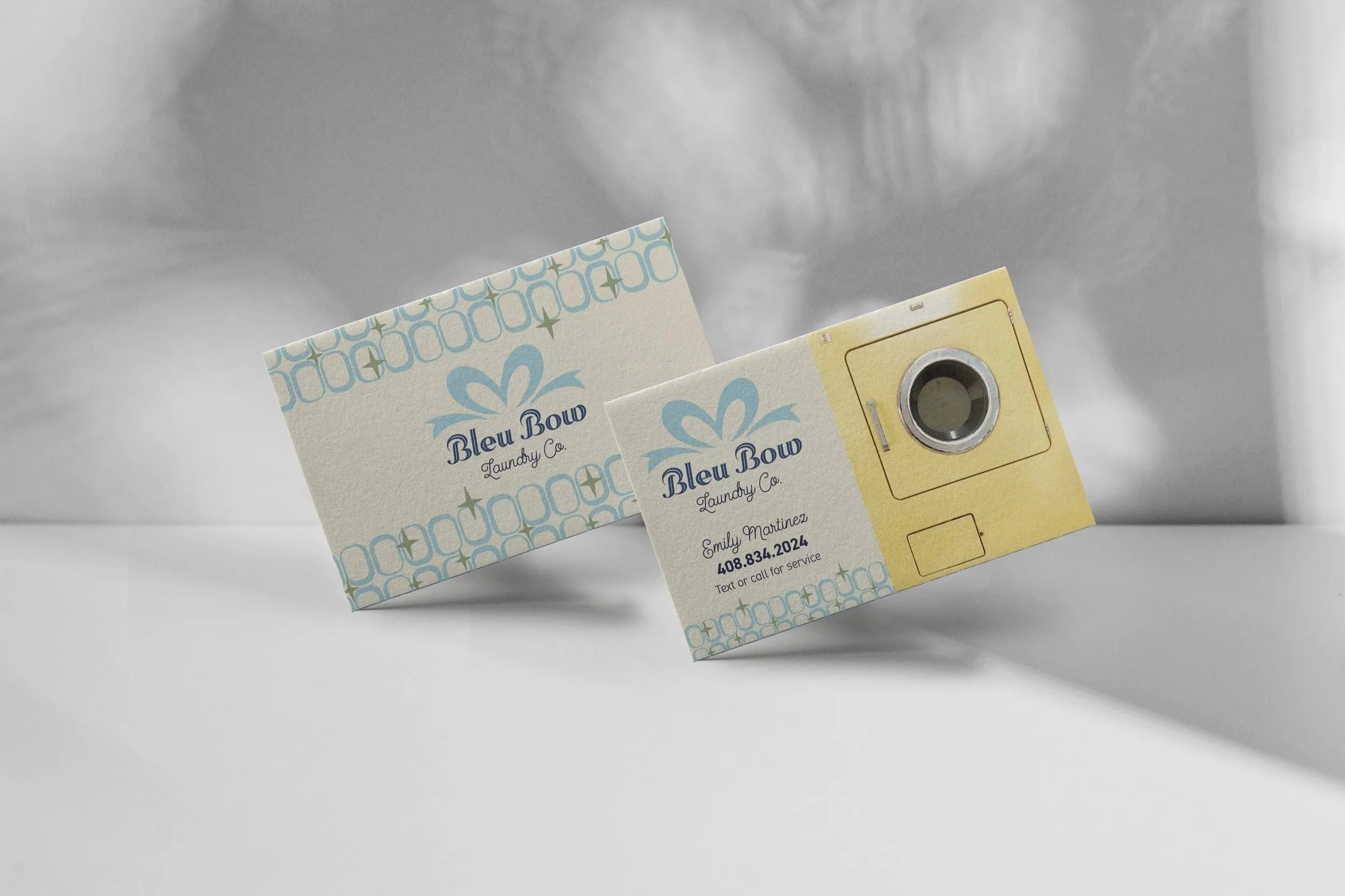
Concept 1 Business Cards
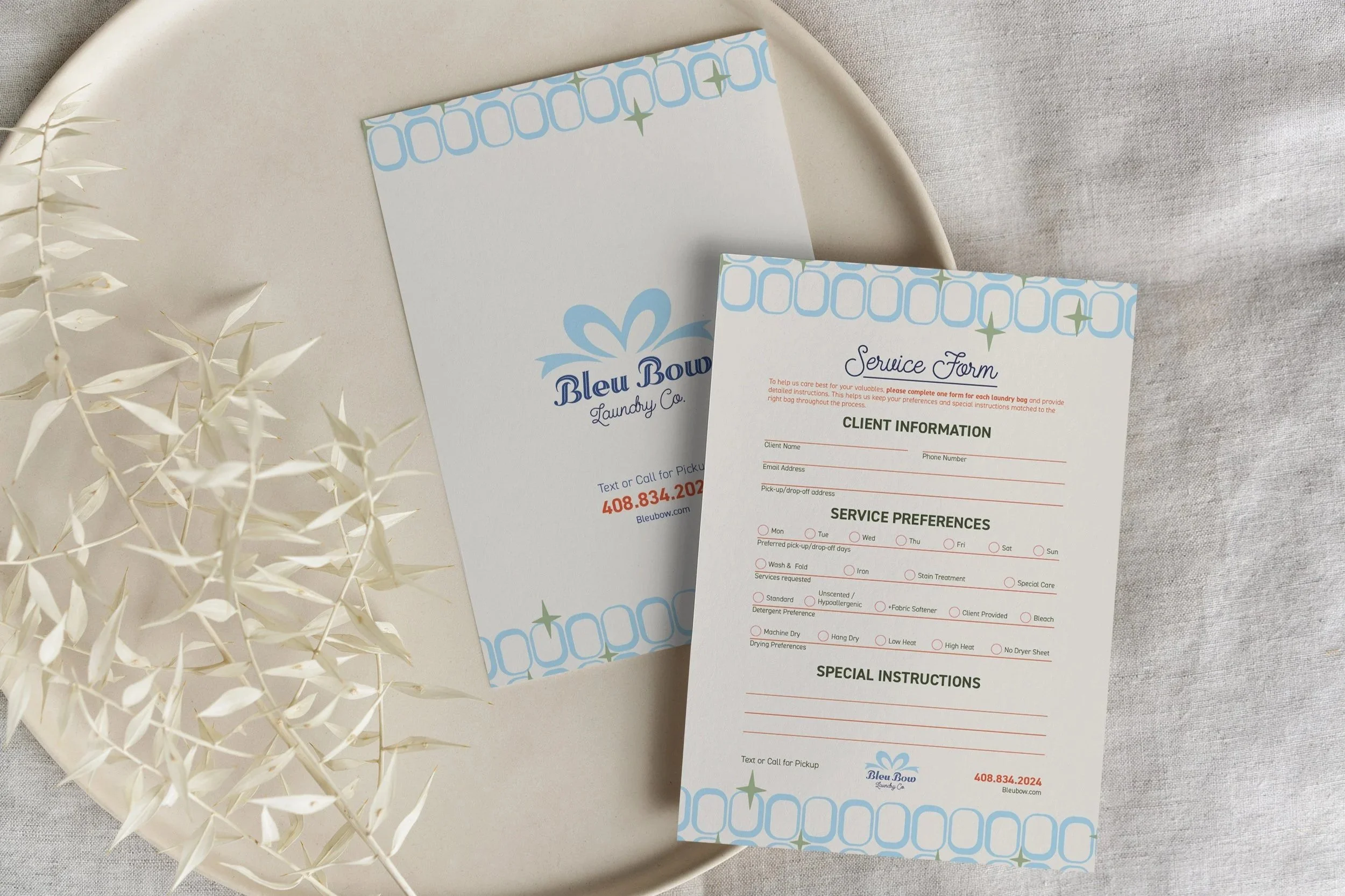
Concept 1 Service Intake Form
Concept 2: French Laundry
With Concept 2, we explored a more elevated and sophisticated look. We also wanted to challenge ourselves by seeing what we could create with a single brand color. One color is more economical to print, which matters for a smaller brand, and it still looks bold. We chose a deep blue, which signals trust, cleanliness, and freshness, set on a cream background.
For typography, we paired two typefaces: one for the brand name and one for the body text. Funky Dory is a bold, funky display typeface that gives the brand some personality, and we reshaped the D, Y, and L into custom letterforms so the logo feels customized. Roka is an easy-to-read but chunky serif typeface that sets the pricing and important details.
Then we built a design system around a blue, diagonal stripe and a framed rectangle as a holding device for all the information. A botanical sprig of lavender adds a finishing “fresh” detail. Together, these elements elevate the brand and make every deliverable instantly recognizable. The door hanger shows it best, because it's bold enough to notice from the driveway.
We recommended this direction, and ultimately, after much deliberation with co-workers, Emily selected concept 2.
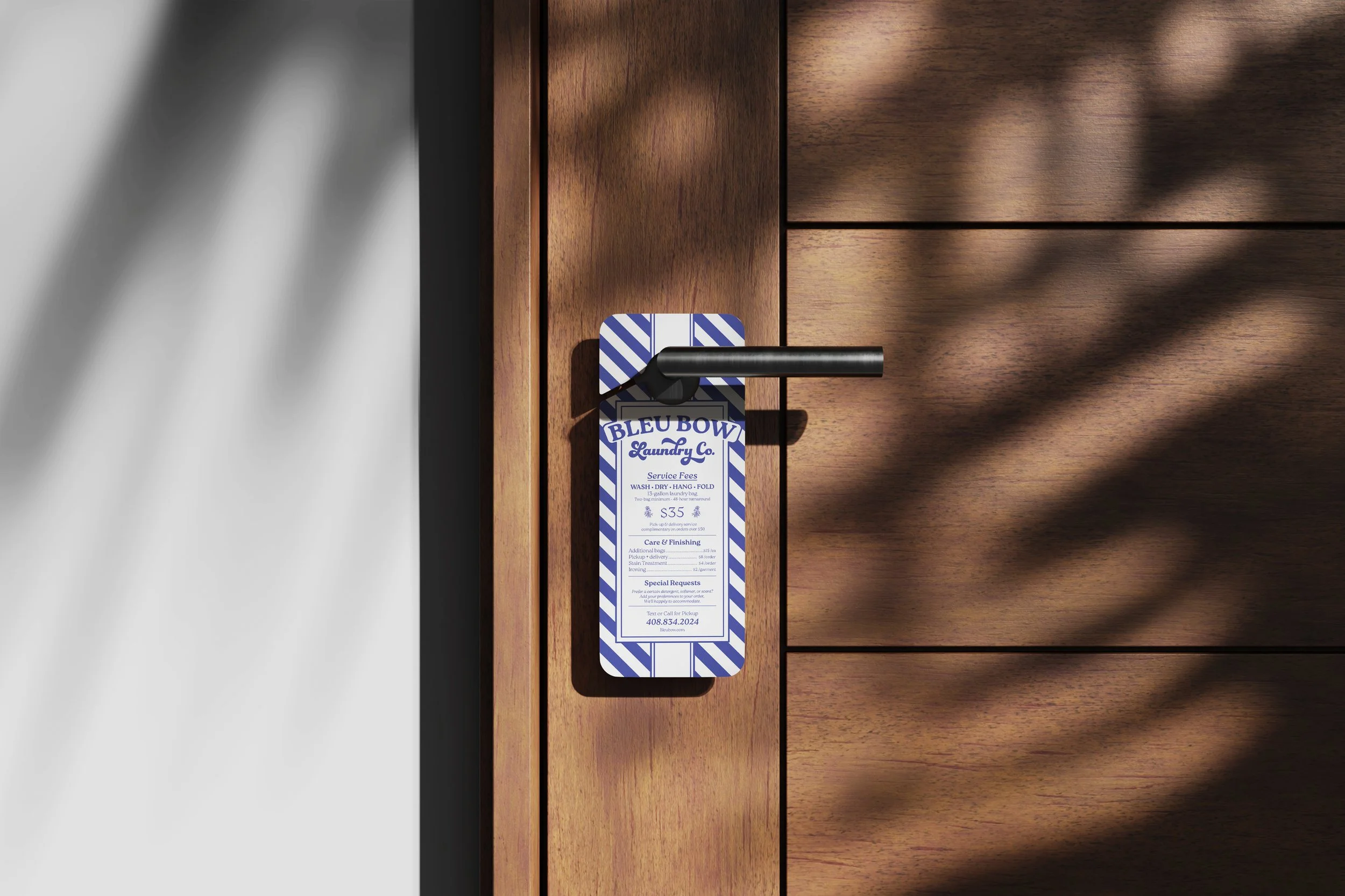
Concept 2 Door Hangers
Drying Down the Details
Emily runs the business lean, so we wanted to estimate print costs for all the collateral before we even started designing.
Business Cards
For a solo service business, trust travels from person to person. As Emily networks, she can hand out business cards to potential clients. A happy client hands the card to a neighbor and so on, creating organic word-of-mouth.
Emily primarily books and answers questions via text, so the phone number should be the primary element in the hierarchy. The card uses the same stripe-and-framed-logo system as the door hanger, so anyone who has seen one instantly recognizes the other.
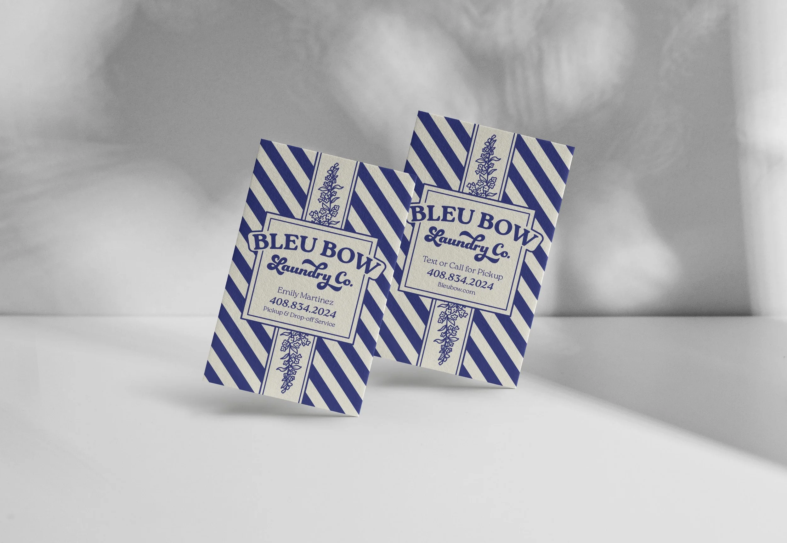
Business Cards
Service Intake Form
Personalization is what sets Bleu Bow apart, so the intake form is where the brand keeps its promise. Clients can tell Emily their detergent preference (scented or unscented), whether they want fabric softener and which scent, how they want their clothes hung or folded, and anything special about delicates or button-ups. They also note where to leave the laundry if they're not home. The bottom of the form has a special instructions area for any additional notes.
The form is a 4x6 postcard printed on thick cotton-rag card stock, so it feels like part of the service rather than paperwork. It also serves as an interim solution until a website with digital intake forms is available.
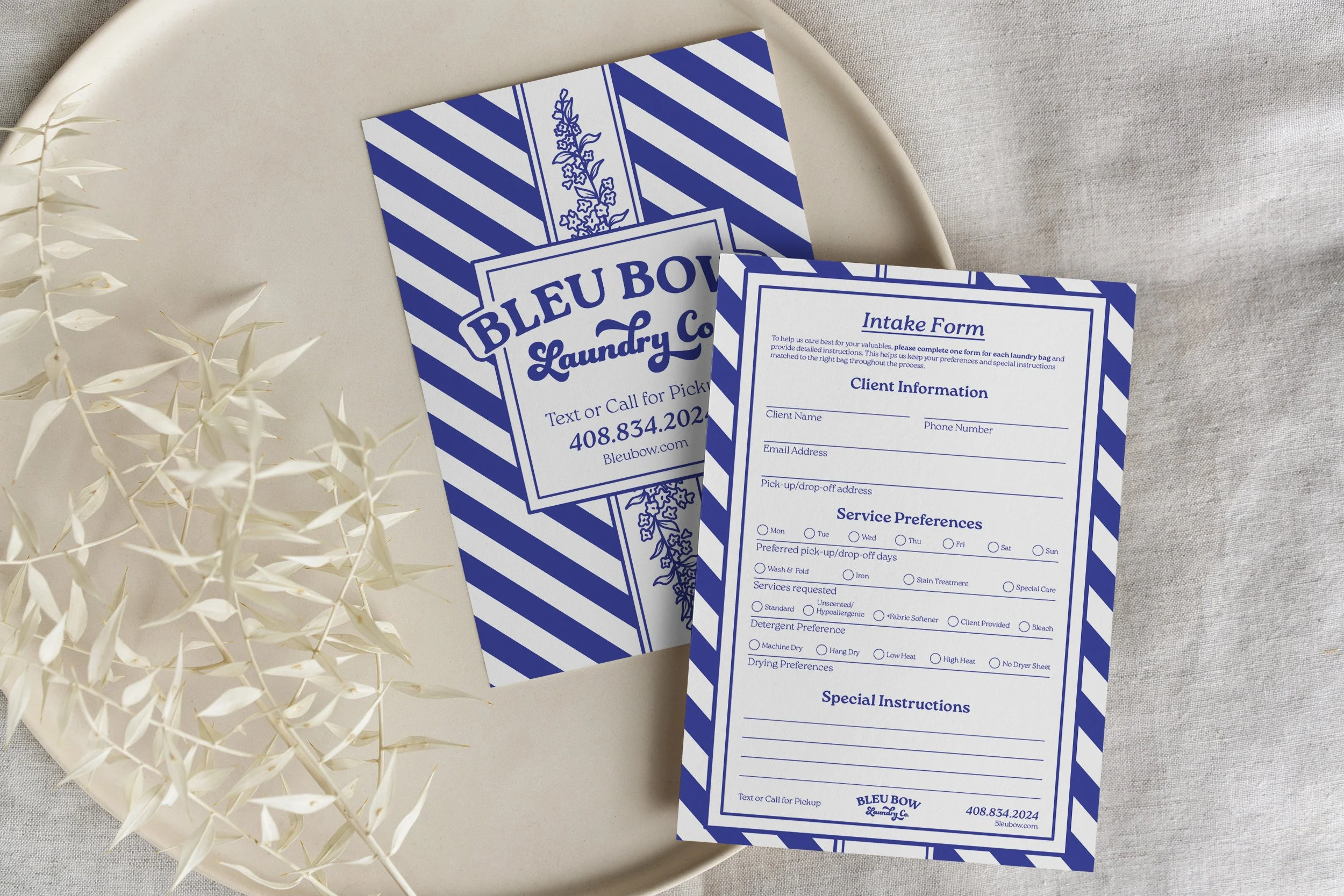
Service Intake Form
Canvas Laundry Bags
For clients on a monthly retainer, the screen-printed canvas laundry bag replaces a 13-gallon trash bag and adds a more premium touchpoint for repeat customers. It also doubles as mobile advertising whenever it travels from the house to the curb.
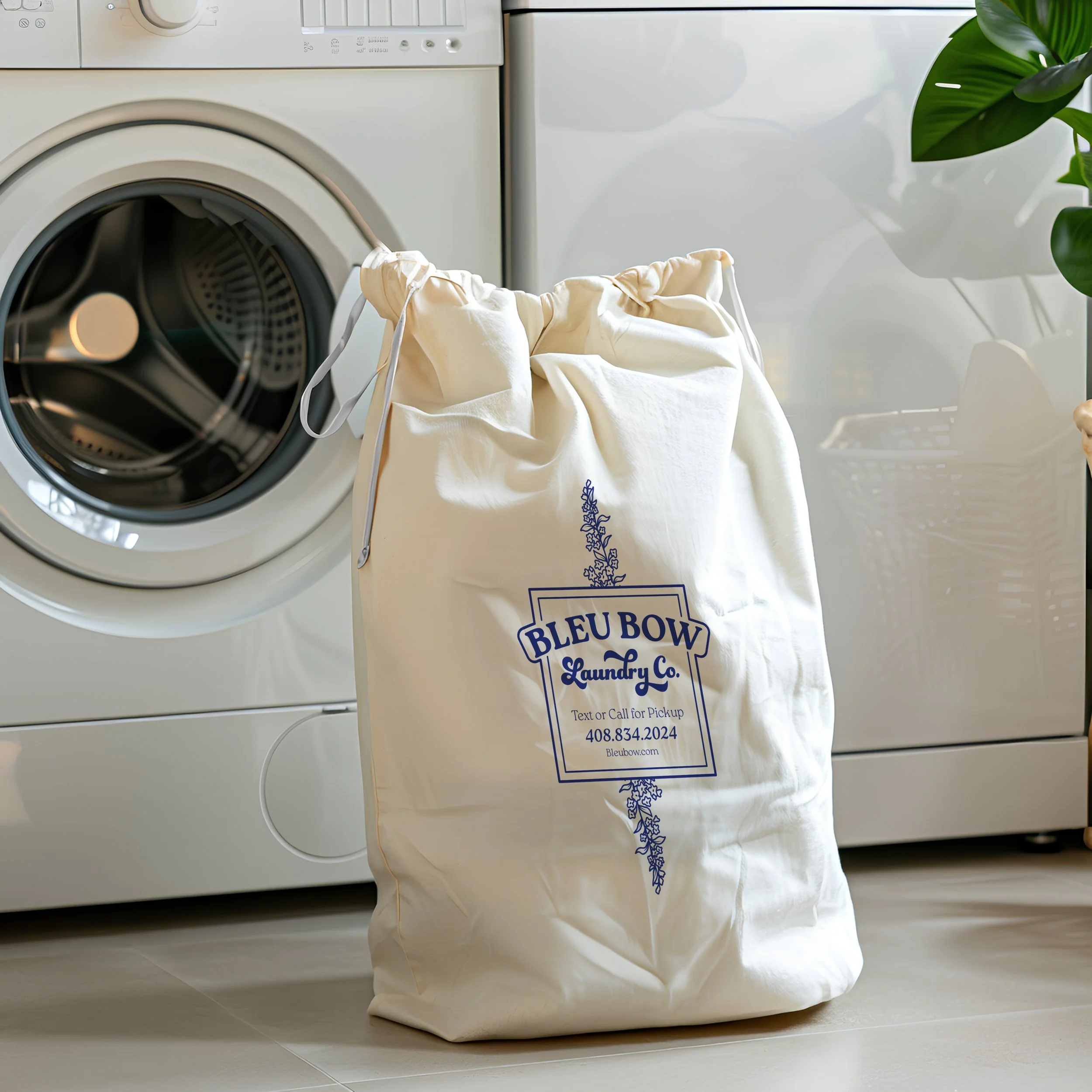
Canvas Laundry Bag
Blue Ribbon
With a name like Bleu Bow, tying freshly cleaned laundry in a neat blue bow felt like an obvious way to add surprise and delight for customers. It makes their laundry feel like a gift and creates emotional positivity that will bring customers back. This also shows customers that Emily truly cares about their laundry, because they can see the attention to finishing and packaging, in addition to the care put into the service.
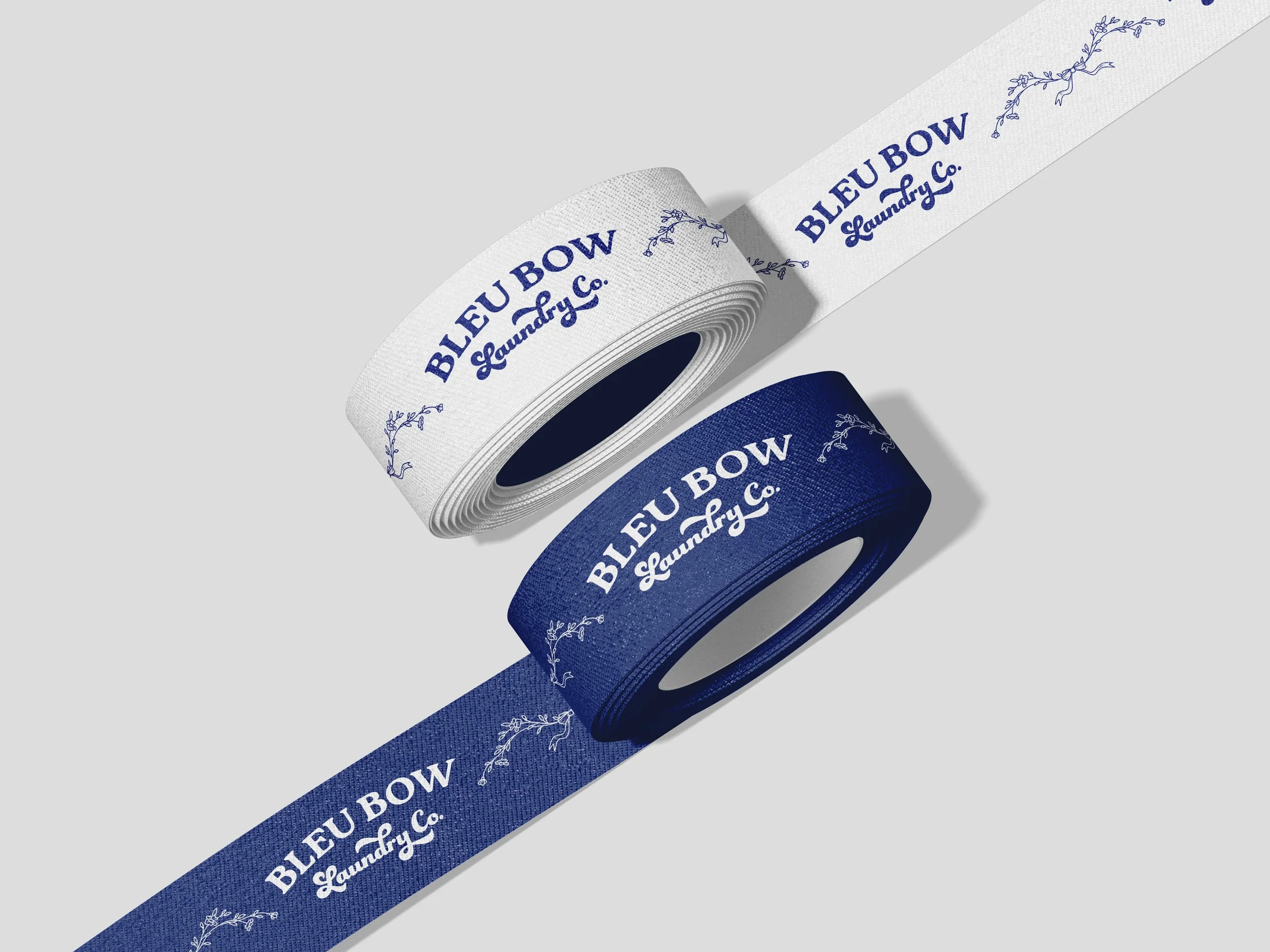
Branded Blue Ribbon
The Thank-You Card: Close the Loop
Every order includes a thank-you card with a punched hole, so the ribbon feeds through it and the card hangs from the bow. It thanks the customer for their patronage, builds brand loyalty, and leaves room on the back for a handwritten note from Emily.
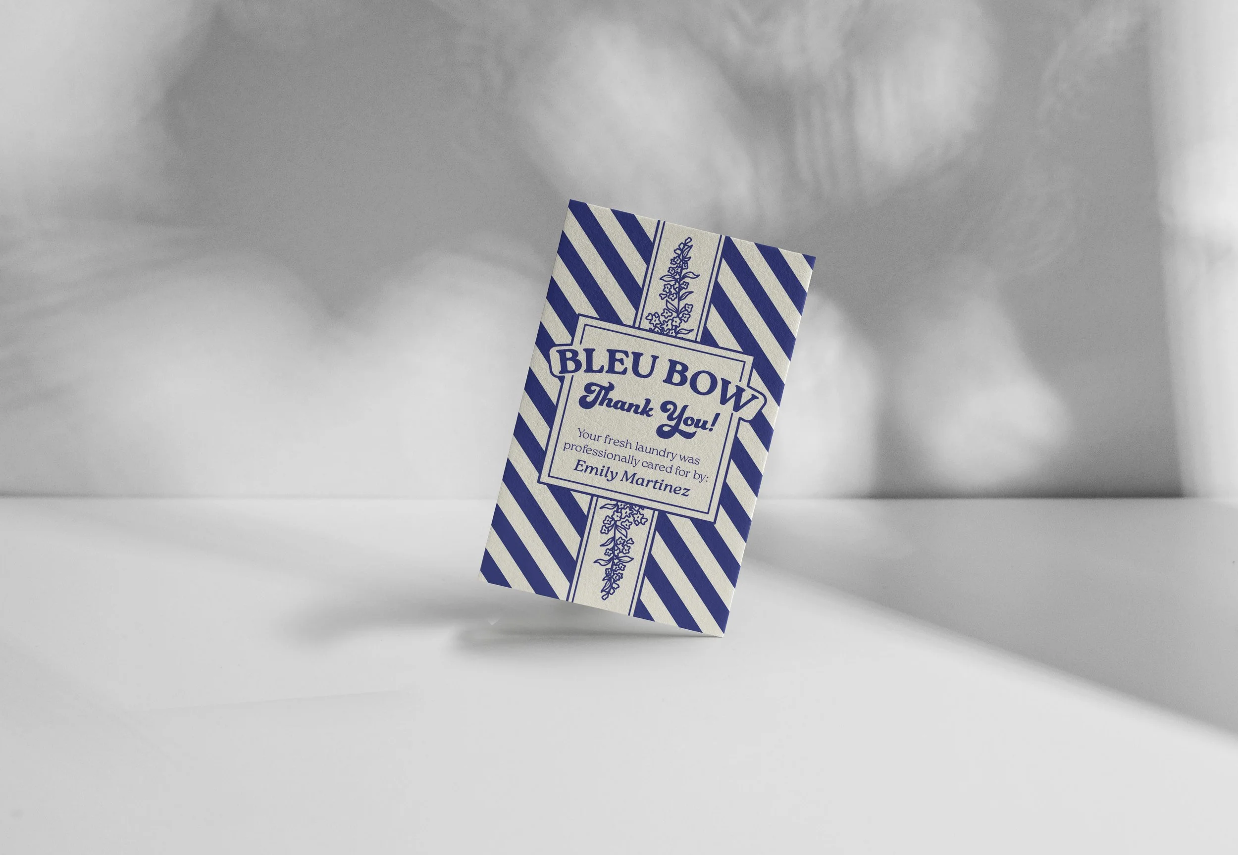
Thank you card
Scrubs
Emily wears the scrubs during pick-up, drop-off, and consultations, so the brand is with her every time she meets a client. The uniform helps build trust and conveys the cleanliness and care the brand should project. The logo is embroidered on the chest, keeping the uniform simple and on-brand.
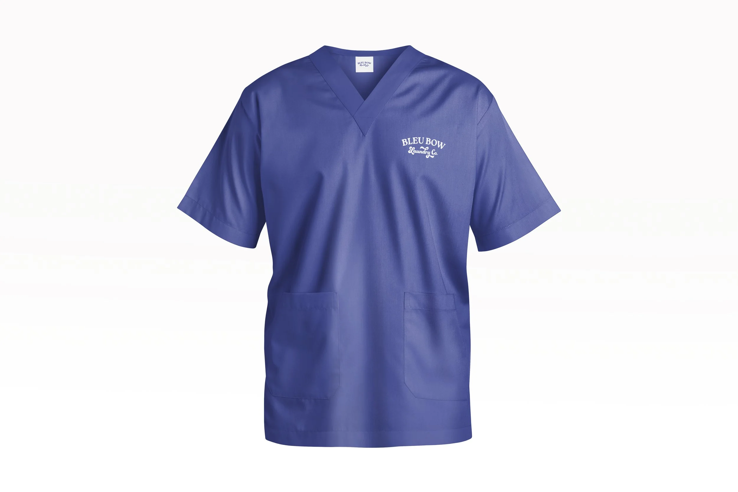
Blue Scrubs
Pressing one color into shape
Working with a single color is hard. Without color contrast, there's no way to direct people where to look first, and the design could look boring and flat if mismanaged.
However, we turned this limitation into the brand's strength. We chose a bold, high-contrast blue and paired it with an equally bold stripe to help the brand jump out at you while still feeling incredibly luxurious and readable.
Because every deliverable follows the same design system, the brand becomes instantly recognizable.

Design System
Collaborators
Emily Martinez — Client
Cameron Rennacker — Creative Director
Joshua Rennacker — Account Executive